Why, when, and how to use animation in your UI, what UX Choreography is, and what all of this has to do with Star Wars.
I used be a print designer, then web designer, then UI designer. Now I’m becoming a UX choreographer — great title to put on a resume. So here’s how that happened: I can’t code. What that really means is I can’t make my designs come to life. I’ve spent hours and hours explaining what happens when you push that button. I needed a better way to explain how interactions work, so I decided to start animating.
First, I tried doing it frame-by-frame in Photoshop. It was every bit as horrible as you imagine. Then, I discovered Timeline mode in Photoshop. Didn’t help much. Alright, so it must be about tools. I asked around and someone recommended After Effects. I downloaded After Effects, launched it, and have been screaming in pain ever since. So I went on YouTube and looked for tutorials. Tutorials taught me how to make a blue ball jump around, and I’m still not sure how to make that relevant to my app’s UI.
Alright, I figured it must be about best practices. I went on Dribbble and added the “animation” tag feed to my RSS. That was a year ago. People were posting roughly 150 animations a day, and I was examining all of them. So basically, this year alone I’ve watched over 55,000 GIFs.
And then something magical happened; I started noticing certain patterns, understanding what kind of problems each designer was trying to solve. I started collecting things and categorizing them into Dribbble buckets, constantly renaming and restructuring over and over, throwing out what didn’t fit any more.
What I discovered was that there weren’t any best practices. Not yet. UI animation was a pretty uncharted territory, everyone was trying to approach it from different angles. Some said it was about function. Others preached authentic motion. And a whole lot of others didn’t believe things should move at all.
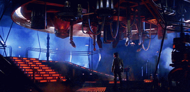
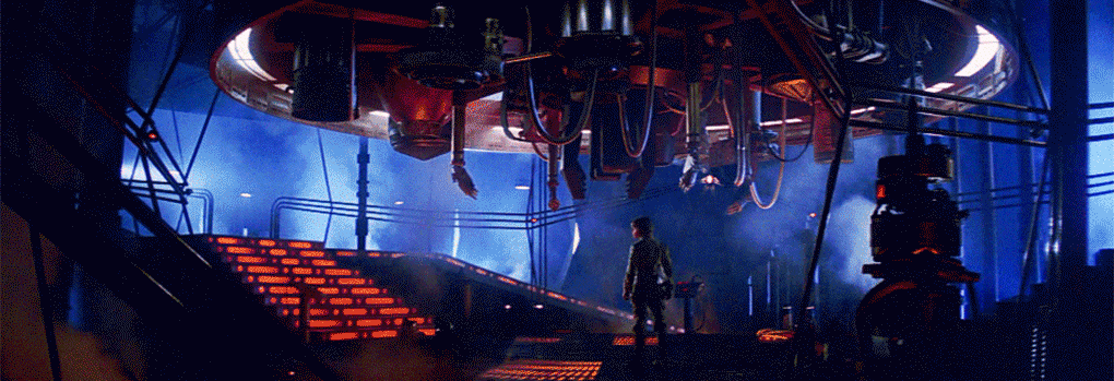
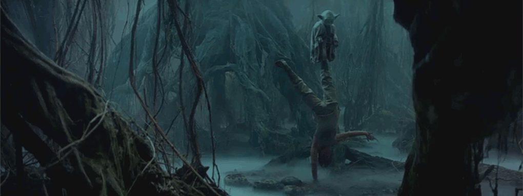
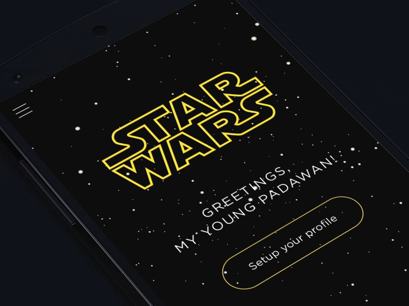
Just like young Skywalker on Dagobah, we need to believe first. So let’s talk about the fundamentals of animation, why and when you’d want to animate your UI, and how it can help you make your UX better.
Blockbusting the UI
I like sci-fi movies. A problem with sci-fi movies is that they happen in a vast fictional universe that I have no idea about. There’s a ton of stuff going on and only two hours of screen time to get me up to speed.
So how do the best sci-fi directors solve this problem?
They focus on the characters instead of the galaxy far far away. They weave the history of fictional worlds seamlessly into the character storyline without letting us fall behind.
They make fictional universe feel real by following the laws of physics we’re accustomed to, by describing it with physical precision and attention to material details.
Finally, they make the world delightful and memorable by adding the “secret sauce”–the magical appeal that keeps it all together.
Similarly, in UI, we want to tell a great interactive story on tiny screens. Our characters are UX flows, our fictional universe consists of UI controls. And we don’t have two hours — we’ve got merely seconds before a user is confused and loses attention.
Just like movie directors, we want users to understand our characters: who’s the good guy, who’s bad, and who’s merely an extra. We want them to believe in our fictional universe, love our movie, buy some merchandise, and come back for the sequel.
If we put all of that together, we can define three “buckets” of animation: Functional, Material, and Delightful. Animation can help us achieve UX goals and make UI feel more consistent and real, all while driving adoption of an entire product.
Functional
Optimize perceived user experience, make it feel faster and more comprehensive
Drive users’ attention
Provide visual feedback and prepare for next steps
Material
Build animation upon a consistent IA and material UI model
Define the spatial relationships between screens and elements, their relative height and elevation, weight and velocity
Delightful
After the first two components are met, add some humanity and fun
Make it feel unique and stand out from the crowd
Entertain users and help them relate to the product
Functional animation
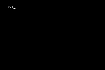
One of the first animations I ever saw was a cursor blinking in the MS-DOS command prompt. It was friendly and inviting — like, “go ahead, type something”. But it was also functional — if the blinking stopped, that meant the system halted and possibly caught fire. It took me 20 years to understand the meaning of that little thing — animation was crucial to suggesting interaction as well as understanding the system states.
State changes in UI (especially on the web) often involve hard cuts by default, which can make them difficult to follow. In cognitive science this is called change blindness — when sudden change in visual stimulus prevents users from noticing new information.
Functional animation fills the comprehension gaps.
It allows user to follow the story of your app without falling behind, the same way they follow a movie. Animation helps people orient themselves within the interface, find their way around, or establish visual relationships. Our brains and eyes are hardwired to pay attention to moving objects — it’s a reflex. Magicians use movement to perform sleights of hand. Animation can help the eye see where a new object comes from or where a hidden object goes (and likely can be found again).
A good animation can tell the story much faster than any words or illustrations. The language of animation is universal — you don’t need to translate it to Russian or Japanese. Properly created transitions can onboard and orient your user faster than any flashcards.Always think about the perceived user experience instead of abstract “number of clicks”. Rachel Nabors from Salesforce tweeted an example of abstract “total load time” versus actual perceived time by users. For example, shake animation on incorrect password entry seems to take more time than instantly displaying a small error badge. In reality, a user might spend a couple seconds trying to locate error message to find out what went wrong, instead of noticing the animation and instantly understanding the action.
Material Animation
Material animation is usually largely misunderstood. It’s not about Google stuff, it’s about making your UI spatially logical and then animating it according to the laws of physics. When your animation takes into account things like gravity and inertia, velocity and rigidity, it looks authentic and helps people memorize UI and UX patterns more easily, because they’re familiar and predictable. But if it doesn’t look realistic, it could make your app or website look cheesy and lead users to distrust your content entirely.
Material animation makes UI more predictable and easier to navigate.
As a designer, you have unlimited ways to draw fictional worlds within your apps and websites. Every UI “world” has unique map. Your menu could be off-canvas or hiding inside the floating button, you could put stuff in expandable drawers or a carousel. But no matter what you do, keep it real and logical, so that brave pioneers of your digital world can always find the way home.
Users are new to the fictional worlds we’ve created–pioneering and learning from scratch. They need to understand where things come from and where they can find them again so that it doesn’t feel hard-cut, because hard cuts don’t exist in the real world.
Another problem of UI animation is bad taste. Taste is subjective, but overall, it’s about aesthetics, and human aesthetics are based on the world around us. If you use good mechanics, dynamics, and optics as a baseline, it’s much easier to create a tasteful animation that won’t go over the top.
Delightful Animation
My mom’s first computer (25 years ago) was a Power Mac. When I asked why she chose a much more expensive option over a PC she said, “Because it was smiling at me.” We all appreciate the value of humane, delightful products over boring and rational .
Of course, animation needs to be functional and material above all else. But as human beings we’re not only rational, we’re emotional. We want to have fun. We want to love our apps and websites and relate to them, and animation can make your user experience truly delightful and memorable.
I’ve seen a physics professor critique Star Wars after watching it for the first time. “Lasers don’t make sounds in vacuum!” he cried. “Lightsabers can’t exist, and even if they could, they would never clash like that!” And…so what? It’s awesome! And that’s what we love Star Wars for. In terms of cognitive science this is called “suspension of disbelief” — making a fictional tale so delightfully engaging that it lets us suspend rational judgment and ultimately memorize the content much better.
Rational is usually boring. Boring directors shoot blockbusters by the book, meticulously copying so-called “best practices” without adding a bit of themselves to their work. Without giving it a soul.
Make animation a part of your brand.
The best movie directors have a distinct and recognizable style, and you should enchant your animation with a unique appeal that people will love and remember.
The Canon
Any good sci-fi universe has what’s called a canon, a set of fundamental laws and principles the world lives by. In the world of animation, a canon was created when Ollie Johnston and Frank Thomas defined the 12 principles of animation in their 1981 book Disney Animation: The Illusion of Life.
Earlier this year, Glen Keane, one of the greatest Disney animators, and Rebecca Ussai, designer at R/GA, delivered a great talk called UX Choreography, a first attempt to redefine the 12 original principles as five laws of UI animation. I think their framework is great, but mostly covers functional animation and less so the “material” and “delightful” aspects. In my opinion, the original 12 are so good that they all apply to UI animation. I’ll try to re-order and regroup them to follow the same basic ingredients: blue for material, green for functional, and orange for delightful. Let’s see how these principles apply to UI/UX animation individually and also in relationship to each other.
The first group of principles covers the material properties of your UI, and therefore, the animation. I’d recommend applying Material principles before Functional because they have to deal with the information architecture and the material model of your UI.
Solid drawing is a basic material principle. It’s about honoring the rules of three-dimensional space and giving objects and characters appropriate dimensionality via volume and weight. Solid drawing requires animators to understand the basics of three-dimensional shapes: anatomy, weight, balance, light, and shadow. Disney animators wanted to make cartoons look real so that people would better relate to them. What they used to call solid drawing, today, we’ve started calling material design.
There are two way to draw motion: dynamic frame-by-frame (Straight ahead) or more linear Pose-to-Pose. Animators use different techniques depending on the complexity and the dynamics of current transition. The way it relates to our world is how you’re going to implement animation in CSS, XCode, or any other programming language. If animation is simple, you can use a single parameter, like object position or scale, set two keyframes (or poses) and create a relatively linear transition. And if the animation is meant to be unique, captivating, and stand out, you need to carefully draw the motion straight ahead, with lots of parameters involved, often frame-by-frame.
Squash and stretch help describe the mass and rigidity of animated objects and define the properties of material they’re made of. As a designer you should decide if your UI is a world of solid planes, rigid surfaces, and sharp, exact movements; or if it’s more organic, with softer, pliable surfaces and fluid movements. This is part of your motion brand: what’s the style and the look-and-feel of your animation?
Notice that arcs could be applied to the z-axis as well — this is especially helpful when building a multi-layered material animation.Similarly, arcs also help define the motion’s nature. Mechanical things such as cars, bicycles, and trains tend to move along straight trajectories, whereas organic objects such as plants, animals, and, well…us, tend to move along arced trajectories. So ask yourself, is your UI robotic or humane? This principle, along with Squash and Stretch and Straight-Ahead techniques allow you to create more authentic, organic, and memorable motion.
Staging is about emphasizing the central idea of an animation, making it completely clear to the viewer. A well-staged animated transition directs the user’s eye to exactly where it needs to be as they interact with the experience — to an important bit of content or suggested interaction. Most UIs lack a strong conceptual anchor, and as a result, users who are new to it often feel confused as they navigate through screens. But even if you don’t have a UI anchor, you can stage your motion in a way that helps users pay attention to what’s important.
Imagine you’re editing an action scene in a movie; say, the duel between Luke and Darth Vader. Define the overall tempo of your action scene first: is it fast or slow? Then, prioritize individual motions: the most spectacular or important motions (like chopping a hand with a lightsaber) should last longer while secondary motions should be shorter and overlap.Timing is probably the most important principle of all. No matter what you’re animating, users’ perception and comprehension will be defined by the way you build sequence, what you make your primary or secondary motion, what you Ease In or Out.
Composing animation–just like movie editing–requires finesse and practice. The key to truly mastering timing is cubic bezier (or the velocity curve). After Effects plug-ins and generic code libraries offer “basic” curves like Ease In or Ease Out. If you want to start hand-sculpting your motion curves, there’s going to be a lot of trial and error, a lot of snapping fingers in an attempt to catch the right rhythm. Have fun, this is exactly what good movie directors and editors do.
The Follow-through and Overlapping principle is about orchestrating several simultaneous motions. Things around us don’t move in perfect unison, some motions are more noticeable than the others: setting the tone like the movie’s stars and others are subtle and passive, following the lead.
Follow-through is about making the parts of the big animated object (e.g., a UI panel or card) follow the motion of their “parent” in an organic and realistic way. Overlapping makes sure all of that happens simultaneously. Follow-through helps communicate the hierarchy between UI elements and set priorities in your motion symphony, while Overlapping keeps the entire sequence seamless and within measure.
The Secondary Action principle is very similar to Follow-through and Overlapping. This is the bread and butter of a magician’s sleight of hand and manipulating change blindness. It helps you define what should be put in front of the user and what should stay hidden. Pick what’s most important to a user’s comprehension to be the primary motion, emphasize it and make it your movie star while overlapping it with secondary motions. Rule of thumb: secondary actions should never detract attention from the primary ones.
Ease In/Out is one of the most fundamental tools to drive users’ attention and make motion look authentic at the same time. This principle, along with Timing and Overlapping, helps users follow your animated story by creating a comprehension hierarchy.
On the material side, Ease helps convey the laws of inertia — things don’t stop abruptly and don’t instantly speed up in real life. Allowing the laws of physics to exist in your digital world makes experience more relatable to users. On the functional side, people tend to pay closer attention to objects that slow down and defocus on the accelerating objects. The rule of thumb is to Ease Out objects that you want people to pay attention to (especially new UI elements coming into the scene), while letting the unimportant objects leave the scene at a top velocity.
Anticipation is a really powerful principle that can be used both in the beginning and end of your animation. First, it’s helpful in preparing an object for movement, orchestrating the components of a scene — lighting, composition, or even the form of an object — in order to give the viewer a clue as to what’s about to happen. One of the easiest ways to create anticipation is Easing In. Slow down the beginning of important animation and people will pay attention to it in anticipation of something happening. A second way to use Anticipation (or Feedforward, as redefined Rebecca and Glen) is at the end of your animated transition, by providing visual affordance for suggested interactions or gestures. Hey, I’m an off-canvas menu, swipe me!Exaggeration draws most attention, and therefore works best with primary motion.Exaggeration makes movement feel dynamic, alive, and just plain fun. An animation without some level of exaggeration might look accurate, but will likely feel stiff, mechanical, and boring.
Disney’s classic definition of exaggeration is to remain true to reality but to present a wilder form. As suggested by Rebecca and Glen, you can start with exaggerating the Feedback from your UI — make your buttons, knobs, and panels respond to users’ interaction in a delightful and noticeable way. But you don’t have to stop at Feedback — feel free to exaggerate anything you want; just make sure that your functional UX goals are met first.
Appeal is the last and most mysterious of all Disney’s principles. Think about all of the apps and websites you use day-to-day and why you keep using them. Often, there are many others that can solve same tasks, but the ones that people stick to do much more. They surprise and delight you; they enable you to achieve bigger goals. They have more than just a good user experience; they have emotional appeal.
In UI/UX animation, the Appeal principle means staying true and consistent to the motion design style and feeling it conveys. In terms of movies, Appeal is the your unique style as director, what makes people remember your movies, like Wes Anderson’s symmetry or JJ Abrams’ flare.
Conclusion
If you take away just one line, let it be this: functional, material and delightful.
Functional: Make sure your animation solves the user’s need first
Material: Design consistent UI layers that allow spatially meaningful transitions
Delightful: Give your animation some love, and your user will love your product back!
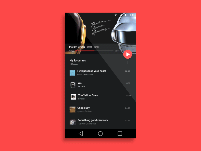
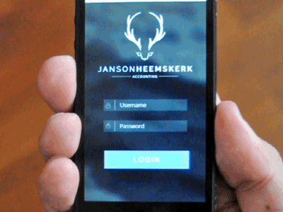
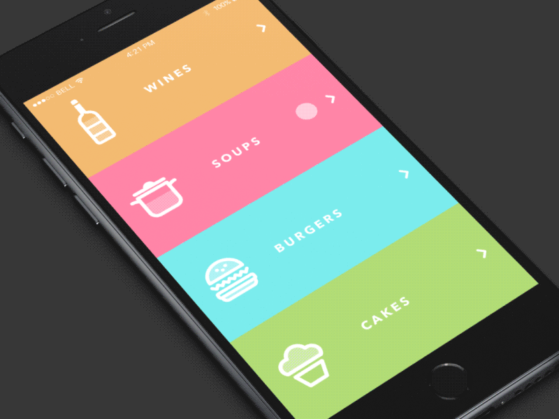
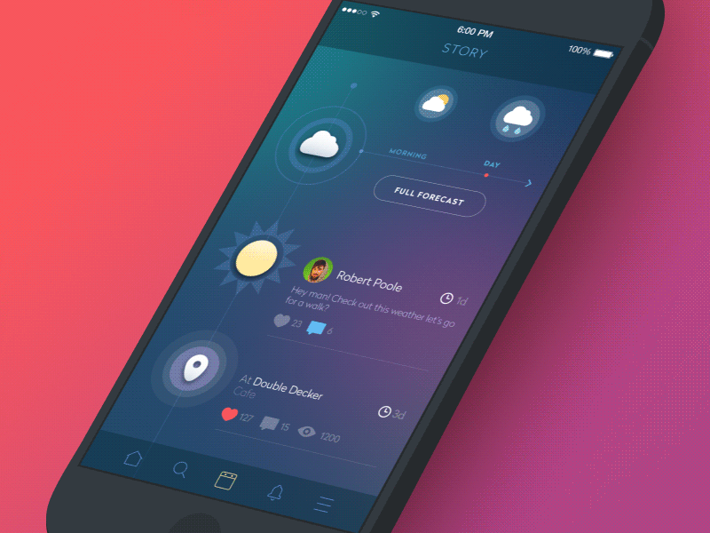
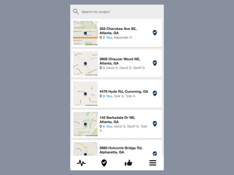
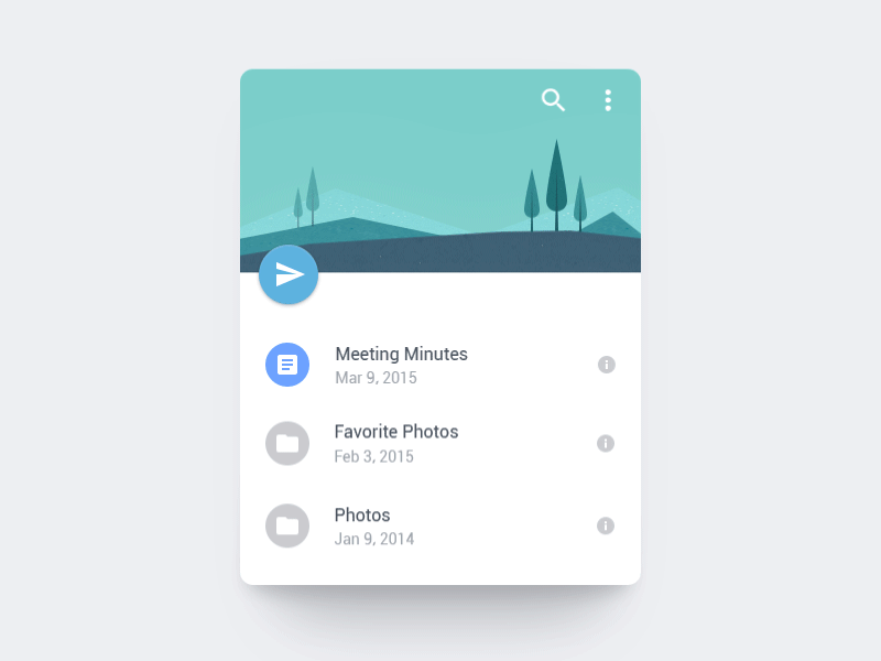
These and many more animation examples are available in my Dribbble buckets. Tweet me at @fiorine, I’d love to chat.Animation credits: superwhite, Eddie Lobanovskiy, Isil Uzum, Rebecca Ussai, Anish Chandran, Jason Teunissen, Łukasz Frankiewicz, Sergey Valiukh, Konstantine Trundayev, Jelio Dimitrov, Ramotion, Jakub Antalik, Pavel Proshin, Kreativa Studio, Justin Ruckman, Nikita NIKI, xjw, Zee Young.And a shoutout to Ryan Roehl (@ryanroehls) who helped me put my thoughts in order.