Why a Clock Widget Is Easier for Picking Time
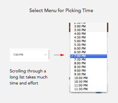
Scheduling events and meetings are tasks that require time input on a form. But picking a time isn’t an easy task. Users have to scroll through a long list in a select menu. Research has shown that users often abandon forms with select menus.
It’s time for designers to get rid of the select menu and offer users a clock widget to pick time. The calendar widget is already in prominent use for picking dates. It’s intuitive because users are familiar with how calendars work. The clock widget would have the same effect.
A clock widget is faster to scan than a long list in a select menu. A select menu would need to include both AM and PM time which would double the length. A clock widget would only need to display the numbers once with an AM or PM button.
It’s also faster to select because users don’t need to scroll through a list. All they need to do is look at it like a clock.
It not only saves time but it also prevents mistakes. The user can mistake an AM time for PM time if they scroll to the wrong end of the menu. Users won’t make this mistake with the clock widget.
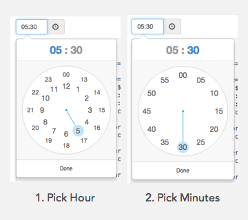
When users click on the text field the clock widget will appear. Users will then click the numbers to select the hour and minutes. The hours dial will display first and the minutes dial will display after.

If you have international users, you should use a 24-hour clock. But use a 12-hour clock if most of your users live in a 12-hour clock country.
Select menus are a pain for users to use. Save them time and offer them a clock widget for picking time. More designers should use a clock widget so that it becomes the new standard. If the calendar widget can work, the clock can too.