Josie shook the television remote furiously—her digital recording device was refusing to record the upcoming episode of The Great British Bake Off. Frustrated, she opened up her laptop and searched the help site for the recorder. Spotting an FAQ entitled “Scheduling Recording” she clicked triumphantly. “This should help me out!” she thought. Josie scanned quickly for her question, but with no luck—the article simply mentioned pushing the record button, which wasn’t working. The next article mentioned a “Subscribe” button, which was nowhere to be found. Finally, she spotted a phone number: “I guess I’ll just have to call… this help desk is not helpful!”
Most of us have had the experience of checking an online website for help, getting lost in a knowledge base article, clicking a few links and emerging out the other side, more lost and confused than before we dived in.
Self-service and documentation sites are meant to help users find an answer themselves, without involving a real person. Helping customers help themselves is good for both the customer and business. Not only is it more expensive to support customers when they call in, but customers get frustrated when the answer isn’t easily available. As a result, most online products people use today have developed an online knowledge base. When someone needs to update his Netflix password and search “update account information,” he uses self service. If these sites are done well, they lead directly from questions to an answer. If done poorly, self-service sites feature long blocks of text that are no help to anyone. At the end of the day, the only thing left to do is to call a customer service agent.
Great design can resolve this problem. Case in point, the UK Government Digital Services (GDS) team, has changed the way they think about online help, and created an amazing user experience for site visitors.
Self Service in Practice
In 2013, the GDS team’s self-service site won Design of the Year, beating out contenders in fashion, architecture, and product. One of the judges even remarked, “it creates a benchmark for which all international government websites can be judged on.” So why is this self-service government site so amazing? Simple: it puts the experience of the user first. They recognized that their users don’t need to understand how government works in order to find what they’re looking for.
In order to keep the user first, the GDS has 10 design principles to follow for every project:
Start with [users’] needs
Do less
Design with data
Do the hard work to make it simple
Iterate. Then iterate again.
This is for everyone
Understand context
Build digital services, not websites
Be consistent, not uniform
Make things open: it makes thing better
These principles shine through the site. Citizens are able to easily access information they need—essentially they can “self-serve.” Satisfaction rates for the services are published live and hover around 87%, so it’s clear people are finding what they need. In this article, we will tour the self-service site to see a few of these design principles in action, with an eye towards bigger principles that anyone can put into place to make their support user experience even better.
Design Principles in Action
Many of the 10 design principles are common knowledge to UX designers. Here we’ll merely call out a few, and show how they helped the UK Government Digital Services team improve their self-serve site.
#4. Do the hard work to make it simple.
If anyone needs to do hard work to solve problems, it should be the UX designer, not the user! “Hard work” in usability means having to search for information, whether because the user has a reading disability, is not a native speaker, or just isn’t sure what phrase to look for.
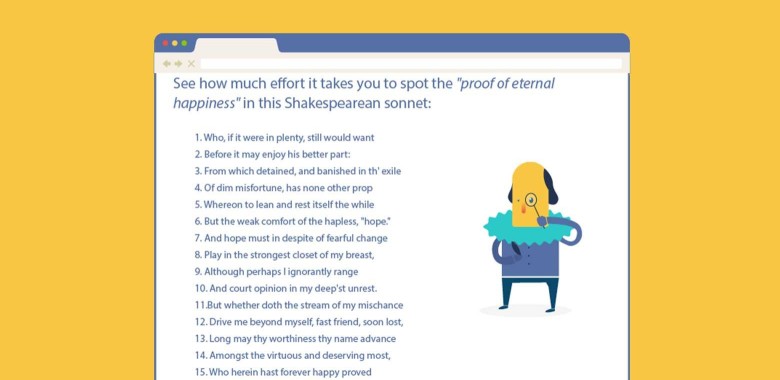
To get an idea of how difficult finding text can be, find the phrase “proof of eternal happiness” in the screenshot below.
1. Who, if it were in plenty, still would want 2. Before it may enjoy his better part: 3. From which detained, and banished in th’ exile 4. Of dim misfortune, has none other prop 5. Whereon to lean and rest itself the while 6. But the weak comfort of the hapless, The phrase is in line 15—pretty tricky, right? The reason is, our question “find ‘proof of eternal happiness’” doesn’t exactly match the wording “who herein hast forever happy proved.” But they mean the same thing.
The lesson is that as designers, we can’t predict how users will phrase their questions. However, we can use user personas, usability tests, and user language studies to determine what words users default to when talking about our product.
To combat these walls of text, GOV.UK has built their articles out into self-assessment surveys, to better direct citizens to the relevant pages. A clear example is the “Check if you need a visa” quiz. The GDS team charted out common situations a visa seeker may encounter. At no point does the user need to think about more than one criterion at a time. Furthermore, the previous answers are shown at the bottom, and it’s easy to go back and change an answer.
A screenshot of the Gov.UK site Visa self-service page.Once the user has selected her answers, she is given the specific information that fits her exact circumstance. Think about what this process would look like if it was just a wall of text! The user would need to scan for keywords, pull out relevant information, and then make a decision. It would be exhausting, and likely lead to confusion.
Even if the best way to present the information is with an article, visual additions such as screenshots, charts, or gifs, customers will add context, making the article easier to use and more appealing to visual learners. While it’s true these tools take longer to create and require additional maintenance, the benefit to the end user makes it worthwhile.
#5. Iterate. Then iterate again.
What gets measured gets managed” –Peter Drucker, Management Guru
Even though the GOV.UK site won an award in 2013, they haven’t stopped iterating. While touring the site, I was informed which articles were in beta, and I was invited to take a survey. The GDS team never assumes the site is perfect, and they continue to seek out user feedback in order to make improvements.
Here’s an example of the Personal Tax Self Assessment page in beta. There’s a lot of reasons for labelling a work-in-progress as a beta: it indicates that the page is new and warns users they may encounter issues. Companies also often include a feedback section on beta pages. If the customer notices something out of place, he can notify the company. Labelling an article as beta ultimately sets better expectations: “this page is a work in progress.”
A screenshot of the Gov.UK site Self Assessment page.The key to iteration is feedback and measurement. This can be accomplished through data analytics (Google Analytics or click tracking) and by surveying users. The GDS team tracks completion rates of applications and quizzes to see if small changes help more people get to where they need to go. Self service needs constant audits and improvements to stay up to date and provide the best possible customer experience.
#2. Do Less (and check the ego).
This means building platforms and registers others can build upon, providing resources (like APIs) that others can use, and linking to the work of others. We should concentrate on the irreducible core.”—from GDS Design Principles
Designing a new solution to a problem can be a lot of fun, but sometimes that means putting time and effort into developing what other people have already created. At the start of any project, a designer should look at how others have solved the design constraint. At the very least, we gain insight into the problem, but we may also realize a 3rd party solution is better. GOV.UK doesn’t let its ego get in the way of providing users with the best service. If someone has already created a better answer, they simply link out to it.
A great example is the Benefits Calculators page. Two not-for-profit organizations have developed their own benefits calculators that are better than what the GOV.UK originally had. On their page, GOV.UK explicitly states that the free tools have replaced their Adviser service. This is a win-win situation for users and GOV.UK: users gain access to a better tool and the govenment doesn’t have to maintain the tool, saving them time and money.
A screenshot of the Benefits Calculator page.This also helps the government build a relationship with organizations that are working towards better services. By working together, they can get more done, and create a better experience for everyone involved.
In the slideshare below, we dive further into the best features of GOV.UK including a massive search bar, contextual articles and a neat-o topic selector.
How to design self-service as good as GOV.UK
I know, I never thought I’d be saying: “Do it more like the government does.” But the GDS team has definitely improved the way citizens find and use information for the better.
These same principles can be applied wherever users need to be given detailed information: onboarding, FAQs, or knowledge base articles.
Dive into the Help Center. Evaluate the flow users take when they attempt to find information or help. Most users don’t want to phone for help, so it shouldn’t be the first option they are given. When looking for a place to begin, talk to the customer support team. They can point to the articles that drive customer calls and information that isn’t (yet) easily digestible.
Utilize different formats. Not all information deserves a quiz. Not all information deserves a chart. Follow Principle 9, “Be consistent, not uniform,” to ensure that content gets the right treatment. While all of GOV.UK is consistent with its branding, they’ve used many different formats to showcase information.
Don’t be afraid to do the hard work. Yes, knowledge base articles are commonplace in most help centers, but that doesn’t mean they are always the best option. Take the time to develop self service options that are easy to use. It pays off.
Any time information needs to be condensed and delivered to the user, there’s an opportunity to do the hard work first and make it easy for the user. Whether it’s a landing page, a user guide, or a product tutorial, we can get the right information to the right person.
About the Author
Yoga teacher, self-diagnosed Twitter junkie, and recent import to London via Vancouver, Canada. Sarah is passionate about keeping customers loyal through amazing customer service, and works at Kayako as Director of Support.