What is the key element of a successful webpage?Simplicity.
Throwing too many elements at your readers at once is a good way to drive them into information overload. Too much at once does nothing to help the viewer interact with a webpage, and it may send them scrambling for the back button.
The common metaphor for designing a simple webpage is that of the restaurant. Just as the wait staff begins with only drinks before asking whether you want any appetizers and going through the meal, the web designer offers the reader only what they immediately need. This means the customer is never forced to contemplate a decision he or she isn’t ready to make.
The Key Mistake: Simplicity vs. Stupidity
The main mistake people make about “simple” is confusing it with “stupid.” By simplifying your website, you’re not assuming your reader is stupid. The principles of designing for simplicity are in fact the opposite of designing for stupidity.
Designing for stupidity means laying out every possible choice in small amounts, and explaining every element. Simplicity assumes the reader can draw on appropriate contextual cues, and so gives the reader choices without explaining them.
Readers appreciate this. While some people may be confused if the cues aren’t clear enough, allowing them to draw their own conclusions or ask their own questions helps them feel in control of the process. Even if the cues need to be explained, giving the answers without allowing the reader to draw their own conclusions makes them feel stupid – which no one likes.
Maintaining Focus
When aiming for simplicity, make certain everything on a website has a purpose and a defined goal. The purposes should be of the same type, or similar enough to be grouped with the main purpose. This cuts down on the complexity by itself, and if everything is working towards a defined goal, the complexity is further reduced.
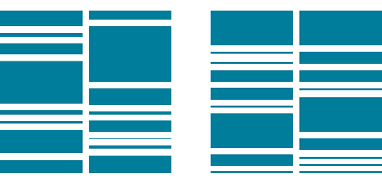
Image Source: Zurb.comThe first image is more complex than the second, which makes the second image better from a design standpoint. Reducing the complexity allows for easier categorization. Although certain systems and situations require complexity, reduce it as much as possible.
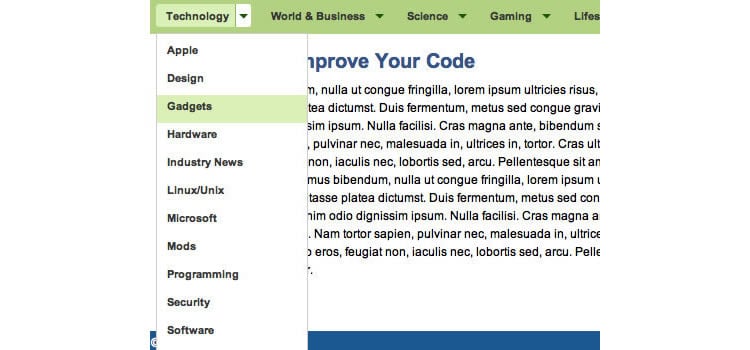
Digg’s (Pre-Redesign) Menu – Image Source: Smashing MagazineThe menu that has characterized Digg for so many years (Digg has recently redesigned its menu), was simple. It categorized the information into similar categories and classified each element. “Design,” “Apple,” and “Security” may not seem to have much in common at first glance, but once you notice they’re all related to technology (specifically computer operation), the categorization is intuitive.
Focus is also provided by a defined goal. Purposeless jumble is inherently complex, no matter how similar the categories are. Providing a goal harnesses the categories to an overriding principle.
Hierarchy of Importance
Determine which elements are the most important to your target audience and which are the least. Then focus your attention on the most important elements. This has been summarized in the Pareto Principle, which states that 20% of any system drives 80% of the results. Due to its simplicity, it has been applied to numerous situations, and while the exact ratio may differ, the general trend seems to hold.
To figure out what the target audience finds most important, study it. Look at what it talks about, how it makes decisions, what it likes and dislikes, and what it ignores. When focusing on simplicity, what the audience doesn’t say can be more important than what it does say. If no one finds a specific feature or argument interesting enough to even comment on, then obviously they don’t find that element important. This can prevent you from overdeveloping features of your site that your audience doesn’t care about.
Don’t ignore these elements, though. That type of oversimplification can get you in trouble further down the line for having unbalanced perspective. But by focusing on what your target audience wants and reducing the amount of effort spent on the elements it cares less about, both your webpage and your process will be streamlined.
Knowing the decision making process doesn’t necessarily help you streamline the individual content, but it helps you determine the best layout for your website. Knowing your target audience always considers a certain factor first, another second, and so on means you can direct their attention to the primary factor on your webpage first, the secondary after that, and on down the line.
Visual Elements
Intellectual content is not the only element of a webpage to require simplicity. The structure of a webpage should also be streamlined.
One way to simplify your website’s visual appearance is to use “flat” or “almost flat” web design. Flat design, if done well, can immensely simplify a website’s visual design. Although boring if overused, “almost flat” design is a good compromise between realism and the iconic flat design. Enough visual cues to achieve depth and texture are retained, while less important features are eliminated.
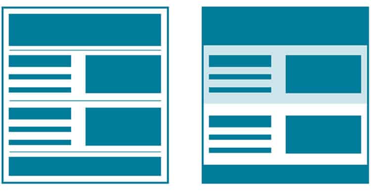
Image Source: Zurb.comPay as much attention to the gaps on your webpage as the spaces with content. Subtle gradations of color can serve as dividers, without needing to put in the visual equivalent of a full break. Using these gradations also serves to break up what could otherwise be a monotonous space.
Streamlining Interactions
No website springs fully formed like Athena from the mind of Zeus. Every site requires designers and programmers. Collaboration, both within the project and between the project and the consumers is important.
The Pareto principle also applies to section meetings. Most programmers and designers are introverts who become stressed by long interactions. Therefore, 80 percent of meetings are perceived as drains on these individuals’ time, while the 20 percent that’s useful could be better handled outside of meetings.
Consider using collaboration tools. This eliminates much of what web designers and programmers find tedious about the meeting process, leaving only the useful results. Two completely free tools are listed in the link above, as well as four that either have free trials or require a one-time payment. If you aren’t certain about the feasibility of using these tools, try one of the entirely free or free trial options. If you don’t see a positive result, you haven’t wasted money – but if you see a result, you have an easy time switching over.
Along with your expert programmers and designers, consider making use of tools that can enhance your site analysis and test your website before its public launch. Using these tools can reduce the amount of content change and retrofitting after launch, because they can catch some of the most egregious mistakes. Nothing can tell you exactly what your target audience will think before the site goes live, but catching some of the potential sources of error can only make your life simpler.
Make use of other experts, whether content, product, or analyzers. These professionals know how people react to stimuli and can give you personal feedback about your site. If you use one, have him or her involved in the site design process to reduce the amount of strain on programmers, designers, and experts.
(Lead image source: Licensed image from BigStockPhoto account)